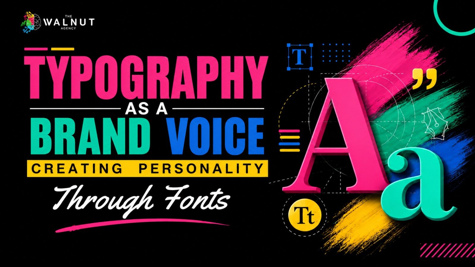
A brand communicates long before someone reads its full message. The logo, colors, images, and fonts all contribute to the impression a business creates. Among these elements, typography often receives less attention than it deserves. The right font can make a brand feel professional, friendly, creative, or elegant, while an unsuitable choice can make its identity feel inconsistent. Typography is not simply about making words look attractive. It is about presenting a brand’s personality in a way that feels natural to its audience.
How Fonts Shape Brand Personality
Different typefaces create different impressions. A traditional serif font can give a brand a more established and reliable appearance. Sans-serif fonts often create a clean, modern, and approachable feel, while script fonts can add elegance or creativity. The important thing is to choose a style that reflects the business rather than following a design trend. A company that wants to communicate professionalism may need a different typographic style from a creative business looking to express a more playful personality.
At The Walnut Agency, branding involves understanding a business, its industry, its competitors, and its intended audience. Typography should follow the same thinking. A font choice makes more sense when it supports the identity the business wants to build.
Choosing Fonts That Match Your Brand Identity
Before selecting a font, a business needs a clear understanding of its brand identity. What does it want people to associate with its name? Which qualities should stand out? How should its visual identity feel across different platforms? These considerations help narrow down the options.
For example, a business aiming for a modern identity may prefer simple, clean typography. A brand that wants to communicate creativity may explore more distinctive styles, provided the text remains readable. The goal is not to choose the most unusual font. It is to find one that supports the brand’s message without distracting from it.
Keeping Typography Consistent Across Every Platform
A suitable font is only part of the process. Using different typographic styles across a website, social media posts, visiting cards, letterheads, and packaging can make a brand feel disconnected. Brand guidelines help prevent this problem. They establish which fonts to use, how headings should appear, and how text should be presented across different materials. This creates a more unified visual identity, even when the format changes.
Consistency does not mean every design must look identical. It means that each design should still feel connected to the same brand. A social media post and a company profile can serve different purposes while sharing the same typographic identity.
Balancing Personality With Readability
A font may look impressive in a logo or headline but become difficult to read in longer paragraphs. This is why appearance should never be the only consideration when choosing typography.
Headings need to stand out, while body text should remain comfortable to read. Appropriate font sizes, spacing, and a clear hierarchy help readers move through the content without unnecessary effort.
This balance is particularly important for websites and digital content, where typography contributes to both the visual appearance and the user experience. A strong design should communicate clearly rather than make the audience work to understand the message.
Building a Stronger Visual Identity With Typography
Typography works best when it supports the other elements of a brand. Fonts, colors, imagery, and logo design should feel like parts of the same identity rather than separate creative decisions.
That is why font selection should be considered during the branding process, alongside research, concept development, and the creation of brand guidelines. When these elements work together, a business can present itself more clearly and consistently.
Frequently Asked Questions
- Why is typography important in branding?
Typography helps communicate a brand’s personality and contributes to how its identity is perceived. It also supports consistency across marketing materials and digital platforms.
- How should a business choose its brand fonts?
A business should consider its values, target audience, industry, and desired identity before selecting fonts that communicate the right impression.
- Can a brand use more than one font?
Yes. Different fonts can serve headings, body text, and other design elements. The key is to establish clear guidelines so the fonts work together consistently.
- Should a brand prioritize style or readability?
Both matter, but readability should not be sacrificed for appearance. Typography should express the brand’s personality while keeping its message easy to understand.
Conclusion
Typography is a small design decision with a lasting role in brand identity. The right fonts help a business communicate its personality, create a consistent visual presence, and make its content easier to recognize and read. When typography is chosen with purpose and used consistently, it becomes more than a finishing touch. It becomes part of how people experience and remember a brand.