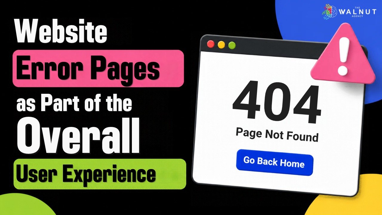
A website guides visitors towards information, products, or services, but not every visit goes as planned. A page may no longer exist, a link may be incorrect, or a technical issue may prevent content from loading. Visitors then encounter an error page. Though often treated as a minor technical detail, it remains part of the overall user experience. A well-designed error page explains what happened and shows visitors where to go next. It keeps the experience helpful and consistent with the rest of the website.
Why Error Pages Matter
When a page does not work, visitors need clear guidance. A basic error message may explain the problem without helping them continue. If users cannot find another route to relevant information, they may leave. Error pages are another interaction between a business and its audience. Their wording, design, and navigation can influence how visitors feel about the website. A consistent experience should remain even when a page is unavailable.
Clear Messages Reduce Confusion
An effective error page explains the situation in simple language. Visitors should understand whether a page is unavailable, a link is incorrect, or a temporary issue has occurred. Technical terms can make the situation harder to understand. A short message should acknowledge the problem without blaming the visitor and suggest what to do next. This makes the page more useful than a dead end.
Helpful Navigation Keeps Visitors Moving
An error page should offer ways to continue. A homepage link, search option, or links to important sections can help visitors find the information they need. Options should be relevant and easy to recognize. Too many links create confusion. Online stores can link to product categories, while service-based websites can direct visitors to service pages or contact information.
The goal is to help users continue with minimal interruption. A useful error page should also avoid making visitors repeat steps unnecessarily. If they were following a link from a product, service, or campaign, offer a clear route back to related information.
Keep the Design Consistent With the Brand
An error page should follow the website’s visual identity. Consistent colours, typography, spacing, and visual elements make the experience feel connected. A different-looking page can make visitors question whether they are still on the correct website. A familiar, simple layout helps maintain recognition: use a clear heading, brief explanation, and visible navigation. Visual elements should support the message.
Consider Mobile Users
Visitors may encounter error pages on desktops, tablets, or smartphones. Poor readability or navigation on smaller screens makes the interruption more frustrating. Responsive design adjusts text, buttons, and navigation to different screen sizes. Links should be easy to tap, and information should remain visible. Test error pages across devices.
Include Error Pages in Website Testing and Maintenance
Include error pages in development, testing, and maintenance. Before launch, check how the website responds to unavailable pages and broken links. Confirm that navigation works and pages display properly across devices.
After launch, maintenance helps identify problems affecting visitors. The Walnut Agency’s web development services include functionality, performance, and security testing, plus post-launch support and maintenance. These activities help keep websites updated and working as intended. Reviewing broken links also helps visitors reach useful content.
FAQs
What is a website error page?
A website error page appears when a requested page cannot be displayed or accessed. It explains the issue and can guide visitors towards other sections of the website.
What should an effective error page include?
It should include a clear message, simple language, consistent branding, and useful navigation options such as a homepage link or search feature.
Do error pages need to be mobile-friendly?
Yes. Error pages should be responsive, readable, and easy to navigate on different screen sizes.
Should error pages be checked after a website launches?
Yes. Regular testing and maintenance help ensure that messages, links, and navigation options continue to work correctly.
Conclusion
Error pages appear when something goes wrong, but they still shape how visitors experience a brand. Clear messages, helpful navigation, consistent design, and responsive layouts make interruptions easier to manage. Including error pages in testing and maintenance helps businesses keep websites useful and easy to navigate.